Do trailing 12 months (TTM) or average ratios, also called normalized ratios, give you higher returns? This is what we wanted to find out by looking at all the research we could find.
What we found
In our book Quantitative Value Investing in Europe: What Works for Achieving Alpha we tested 168 investment strategies in Europe over the 12 year period from June 1999 to June 2011 we also tested trailing 12 months and normalized ratios (5 year average) – the results surprised us.
The normalized ratios we tested were:
- Earnings Yield 5 year average (Average EBIT to Enterprise Value)
- Free cash flow yield 5 year average
- Return on Invested Capital (ROIC) 5 year average
Earnings Yield vs Normalized Earnings Yield
We tested Earnings Yield ratio in two ways:
- Earnings Yield 12 months – calculated as trailing 12-month (TTM) operating income (EBIT) divided by the current enterprise value, and
- Earnings Yield 5 Year Average (Normalized) – calculated as 5-year average operating income (EBIT) divided by current enterprise value.
This is what we found:

Earnings Yield 12 months returns (Source: Quantitative Value Investing in Europe: What Works for Achieving Alpha)
Earnings Yield 5 year average returns (Source: Quantitative Value Investing in Europe: What Works for Achieving Alpha)
Earnings Yield 12 months performed better
If you look at the column Q1 average normalized Earnings Yield (5 Year Average) gave you slightly higher returns than Earnings Yield trailing 12 months except for large companies where Earnings Yield 12 months performed better.
However Earnings Yield 12 months was the better ratio (you can also say stronger) because the bigger difference, on average 227.2% (look at the right hand column Q1-Q5), between the performance of the undervalued companies, quintile one (Q1) and the overvalued companies quintile five (Q5).
Also Earnings Yield 12 months returns declined in a linear way as you moved from Q1 to Q5. This was not the case with Earnings Yield 5 year average where Q5 returns were higher than the returns of Q4.
Substantial market outperformance
Just in case you were wondering market outperformance for both ratios were substantial, over the 12-year period of the study, the market portfolio generated a return of 30.54 % or 2.25% pa, dividends included.
Earnings Yield 12 months was the second most successful single ratio strategy (Free Cash Flow Yield 12 months was the best) to select large cap companies.
Free cash flow yield vs Normalized free cash flow yield
In the back test free cash flow yield was defined cash flow from operations minus capital expenditure, divided by enterprise value.
We also tested two versions of free cash flow yield:
- Free Cash Flow Yield Trailing 12 months
- Free Cash Flow Yield – 5 year average (Normalized) defined as the average free cash flow over the past 5 years divided by the current enterprise value.
This is what we found:

Free Cash Flow Yield Trailing 12 months returns (Source: Quantitative Value Investing in Europe: What Works for Achieving Alpha)
Free Cash Flow Yield – 5 year average returns (Source: Quantitative Value Investing in Europe: What Works for Achieving Alpha)
Free Cash Flow Yield Trailing 12 months was better
Even though using the 5-year average FCF yield on mid cap companies (Q1) gave you a higher return than the 12-month FCF yield, the results for the other market size companies was a lot lower.
Free Cash Flow Yield 12 months also was stronger ration than Free Cash Flow Yield – 5 year average because of the larger difference (257.8%) between Q1 and Q5 returns than 217.8%.
Odd was that average returns for FCF 12 months returns from quintile one (Q1) to quintile 5 (Q5) was not linear – Q5 returns were higher than Q4 – this makes the ratio a bit weaker compared to FCF 5 year average.
Return on Invested Capital vs Normalized Return on Invested Capital
In the previous valuation ratios we looked at buying cheap companies but what happens if you buy quality companies – with quality defined as companies that generate a high return on invested capital (ROIC)?
We tested two versions of Return on Invested Capital:
- ROIC 12 months
- ROIC 5 year average
We defined ROIC as operating income (Earnings before Interest and Taxes = EBIT) divided by the sum of - net working capital (current assets minus excess cash minus current liabilities) and net fixed assets (total assets minus current assets minus intangible assets).
For ROIC 12 months we used trailing 12 months (TTM) EBIT divided by current invested capital and for ROIC 5 year we used five year average EBIT divided by current invested capital.
This is what we found:

ROIC 12 months returns (Source: Quantitative Value Investing in Europe: What Works for Achieving Alpha)

ROIC 5 year average returns (Source: Quantitative Value Investing in Europe: What Works for Achieving Alpha)
Great companies do not make great investments
ROIC returns were lower than the other ratios and the results were mixed - companies with the highest 5 year average ROIC (Q1) did not always perform the best (Q3 did better), and there were no linear returns from Q1 to Q5.
So a great company does not automatically make for a great investment.
Average ROIC 5 year average (Q1) did however do better than ROIC 12 months as shown in the returns however ROIC 12 months had the larger average difference between Q1 (high ROIC companies) and Q5 (low ROIC) companies.
So mixed results that show ROIC on its own is not a good ratio to find good investment ideas.
Summarised results
In the table below I averaged the total returns for large, medium and small companies for all quintiles and sorted the strategies by Q1 (most undervalued or highest ROIC) values.
As you can see the Free Cash Flow trailing 12 months performed by far the best with the following three ratios close together.
Free Cash Flow trailing 12 months was also the strongest ratio as it also had the biggest difference between Q1 and Q5 returns (257.8%). Returns were however not 100% linear from Q1 to Q5.
The table also confirms that only looking for quality companies with a high Return on Investment Capital – ignoring valuation - is not a good investment strategy.
12 months vs 5 year normalized returns sorted from high to low by Q1 returns
Click here to start using the best TTM ratios in your portfolio NOW!
What others have found
We were of course not only people that have tested normalized ratio.
Lucky other researchers and investors have also tested it. This is important because what worked in one market, or over one period, may not work in other markets or other test periods.
Magic Formula normalized vs. 12 month
In December 2011 Alpha Architect published interesting research report they called Magic Score: Long-Term vs. Short-Term.
They wanted to see if the long term Magic Formula performed better than a Magic Formula calculated using values from the past 12 months.
The long term Magic Formula
They calculated the long term Magic Formula as follows:
- Valuation = 8-year average earnings before interest and taxes (EBIT)) to total enterprise value (TEV)
- Quality = 8-year average EBIT to net property plant and equipment (NPPE) plus net working capital
The long term Magic Formula is thus just the same as the trailing twelve months version, except that the valuation ratio includes a long term average of EBIT divided by the current enterprise value. And the quality variable is the average past 8-year EBIT/ current equity.
How they did it:
- Calculate the returns for the standard Magic Formula
- Calculate the returns for the long-term Magic Formula
- They excluded the bottom 10% market value companies on the NYSE
- They only included liquid companies with an average daily traded value of more than $1.5mm (adjusted by CPI)
- Test period 38 years from 1972 to 2010.
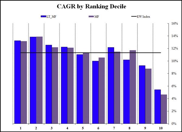
- LT_MF = long term Magic Formula
- MF = standard (trailing 12 months) Magic Formula
- EW Index = Equal Weight index return
- All portfolios were equal-weight
- They rebalanced the portfolios annually
This was the compound annual returns over the 38 year period from 1972 to 2010.
Source: Magic Formula: Long-Term 8-year vs. Short-Term
1 = Best ranked Magic Formula companies
10 = Worse rated Magic Formula companies
Blue bars = 8-year average Magic Formula performance
Grey bars = Trailing 12 months Magic Formula performance
What they found – long term does not add much value
As you can see the results were largely the same (blue bars same as grey). Using the long term Magic formula would not have added much to your returns.
This is unusual
What was interesting is that the second 10% of Magic Formula companies (second decile, no 2 in the chart) performed better than the best ranked companies for both the long term and 12 month Magic formula.
Click here to start using the best TTM ratios in your portfolio NOW!
Are normalized Price to Earnings (PE) ratios better than trailing 12 months?
In June 2005 Keith P. Anderson (The York Management School) and Chris Brooks (University of Reading - ICMA Centre) published a paper called The Long-Term Price-Earnings Ratio
What they tested and how they did it
They wanted to find out if an average Price to Earnings (PE) ratio – they tested one to eight years - performed better than a trailing 12 months PE ratio.
They used data from the UK stock market over the 28 year period from 1975 to 2003 which included all UK listed companies but excluded the financial sector, investment trusts and companies with more than one type of share (voting and non-voting for example).
To make sure their results were not influenced by small illiquid companies they excluded companies with a stock price of less than 5p (GBP 0.05) and the lowest 5% market value companies each year.
Portfolios were formed and re-balanced on 1 May each year.
For companies that failed during the year they assumed a zero recovery price.
This is what they found
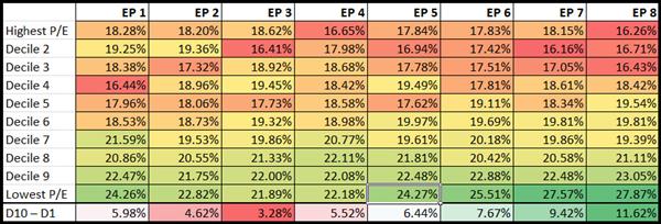
The following table shows the yearly average returns for decile portfolios (all companies sorted into 10 groups by PE ratio) over the 28 years from 1975-2003:
Source: The Long-Term Price-Earnings Ratio
EP1 = Earnings to Price ratio (inverse of PE) calculated as earnings over the last year, divided by the current share price
EP8 = Earnings to Price ratio (inverse of PE) calculated as the sum of normalized earnings over the last eight years, divided by the current share price
D10 – D1 = Return of lowest P/E decile – Return of highest P/E decile (for example, 24.26% - 18.28% = 5.98%
Using more years of earnings do add value – but only from year 6 to 8
As you can see (look at the dark green part of the table) adding more years of earnings increases the returns of the P/E ratio BUT this only starts from year six.
The value premium (Lowest P/E returns – Highest P/E returns) already increases from year five (6.44%) and at year eight at 11.62% is nearly twice that of the one year P/E.
So it looks like using a normalized PE ratio gives higher returns – at least in the UK.
Are five different normalized ratios better than trailing 12 months?
Luckily the great guys at Alpha Architect also tested not only the Magic Formula but also other normalized valuation ratios in a paper called Analysing Valuation Measures: A Performance Horse-Race over the past 40 Years written by Wes Gray and Jack Vogel.
5 strategies tested over 40 years
They tested 5 ratios over the 40 year period from 1 July 1971 to 31 December 2010 to find the best valuation ratio.
They also tested normalized ratios to see if they increase returns.
What ratios did they test?
- Earnings to Market Value (E/M) – You can also call the ratio Earnings to Price – the inverse of the PE ratio
- Earnings before interest and taxes and depreciation and amortization to total enterprise value (EBITDA/TEV)
- Free cash flow to total enterprise value (FCF/TEV) – FCF was defined as Net Income + Depreciation and Amortization - Working Capital Change - Capital Expenditures
- Gross profits to total enterprise value (GP/TEV)
- Book to market(B/M) – the inverse of Price to Book
Companies included and how they tested
- This back test excluded financial companies and utilities, and the smallest 10% of market value companies listed on the NYSE.
- Portfolios were put together on 30 June each year when all the companies were sorted into five quintiles – 20% groups of companies.
- They only included companies for which 8 years of data was available.
Portfolios were re-balanced on a yearly basis.
How the ratios were calculated
For the one year valuation measure companies were selected based on current numerator (top value) and current denominator (bottom value) for each measure.
For all the normalized ratios (2 years – 8 years) they used the average of the numerator over the past N years, and divide this average by the current denominator.
For example, the 8 year FCF/TEV ratio was calculated using the average of the past 8 years FCF for each company (including the current year), and dividing this by the company’s current total enterprise value (TEV).
This is what they found:
Source: Analyzing Valuation Measures: A Performance Horse-Race over the past 40 Years.
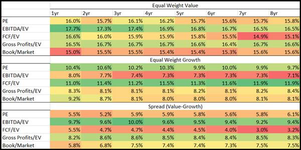
The Equal Weight Value part of the table below shows the equal-weighted returns of the most undervalued (cheap) 20% of companies based on each valuation ration.
The Equal Weight Growth part of the table below shows the equal-weighted returns of the most overvalued (expensive) 20% of companies based on each valuation ration.
The Spread (Value-Growth) part of the table shows the difference between the Equal Weight Value and Equal Weight Growth returns of the two above tables.
What they found
As you can see in this study (look at the dark green areas) they did not find that using normalized values can add to your returns. Only normalized book to market (inverse of price to book) would have given you slightly higher returns compared to the one year ratio.
The best valuation ratio they found was trailing 12 month EBITDA to TEV with an average return of 17.7% over the 40 year test period.
EBITDA to TEV was also the ratio the highest spread (Value – Growth) returns which is a further indicator that it is the best ratio to use.
Click here to start using the best TTM ratios in your portfolio NOW!
Summary and Conclusion
So what does this all mean and how can it help my returns you may be thinking?
Do normalized ratios work or what?
Here is a summary of the four research reports:
Click to enlarge
The returns of each study is separately colour coded (Green = Best, Red = Worse)
So what does the table tell you?
Quantitative Value Investing in Europe
The one year ratios would have given you a higher return than the 5 year average ration.
This was not the case with ROIC – but as you can see that was not a good investment strategy anyhow.
Magic score: Long-Term vs. Short-Term
Here you can see that the eight year average Magic Formula performed slightly better but only marginally so.
This is a good thing because the trailing 12 months Magic Formula it is a lot easier to calculate and because eight year data may not be available for all companies in your investment universe.
The Long-Term Price-Earnings Ratio
This study is the only one that makes normalized ratios look promising – the eight year average PE ratio did a lot better than the one year ratio, but only from year six, before that the trailing 12 month PE ratio would have been better.
Unfortunately this result could not also be duplicated in the USA - see the next study.
I have no idea why this is the case as the higher eight year returns look attractive. It may just be that it worked better over the tested 28 year period from 1975 to 2003 in the UK as the study below overlapped the UK test period but was over a longer period.
A Performance Horse-Race over the past 40 Years
This is by far the most comprehensive study as it’s over a longer period – 40 years – and covers more ratios.
None of the normalized ratios performed better, so your best bet is using trailing 12 month data.
Also it looks like EBITDA to Enterprise Value was the best ratio to use. Unfortunately they did not include EBIT to Enterprise value the one I like best and the one they also found best in the book Quantitative Value.
So a very long story short
This was a very long post with a simple conclusion – stick to trailing 12 month ratios when looking for investment ideas.
PS To get all the tools to implement ALL these strategies (and more) in your portfolio why not sign up right now, it costs less than an inexpensive lunch for two, just click here: join now
PPS It’s so easy to put things off, sign up now and start improving your investment returns
Click here to start using the best TTM ratios in your portfolio NOW!


