This article shows you how to research a company found using the Quant Investing stock screener.
You will find companies you have never heard of
When running a stock screen you will definitely find companies you have never seen or heard of before. By clicking on the company name you can quickly find a lot more information on the company.
This is how it works.
If you look at the results of any screen you will see the company’s name is shown in colour – this is because it is a hyperlink you can click on to get more information on the company.
Just click on the company’s name.
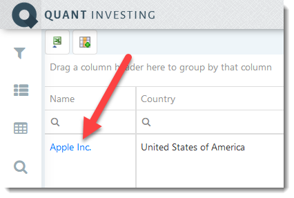
This will open the company information page.
This is what the company information pages shows
The page shows you a lot of company specific ratios and indicators. This gives you an overview of:
- Description - what the company does, market and traded value
- Valuation,
- Valuation compared to world, country and industry sector
- Historical valuation,
- Momentum,
- Quality
- Growth
- Stock price
Remember detailed information on exactly how all the ratios and indicators are calculated can be found in the Quant Investing Glossary.
Here are examples along with definitions for Apple Inc.
General company Information
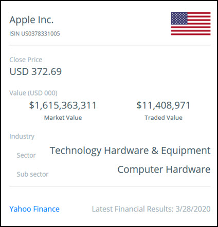
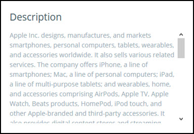
Here you can quickly see what the company is all about, including a short description of its business.
Traded Value shows you the median trading value of the company’s shares for the last 30 trading days in the main stock market the company is listed on in thousands of US Dollars.
Latest Financial Results shows you the date of the latest financial results included in the stock screener database in the format MM/DD/YYYY.
The Yahoo Finance hyperlink takes you to the company's page on the Yahoo Finance website if one is available.
Click here to get all the information you need to make confident investment decision!
Quality ratios
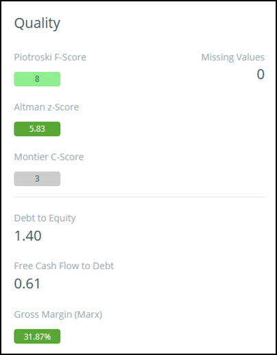
Using this part of the dashboard you can quickly see the company quality ratios and indicators.
Missing Values shows you how many of the 9 Piotroski F-Score values could not be calculated. If a value cannot be calculated a 0 value is assumed. For example, if the Piotroski F-Score = 6 and the F score missing values = 3 it means 3 of the 9 Piotroski F-Score ratios could not be calculated because the data was not available.
If a component of the Piotroski F-Score cannot be calculated a 0 value is entered for that component.
Detailed information on how all other ratios and indicators are calculated can be found in the Quant Investing Glossary.
Growth ratios
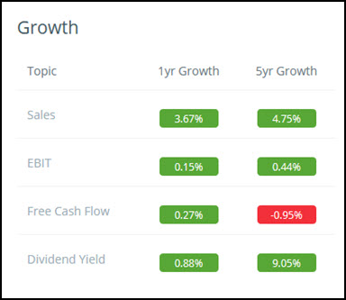
The 1yr Growth ratio shows you the one percentage growth.
The 5yr Growth ration shows the five year annual compound growth rate.
Compare a company to world, country and industry
The dashboard also lets you easily compare the company you are analysing to other companies:
- Worldwide
- in the same Country
- the same main industry sector worldwide
This is what it looks like:
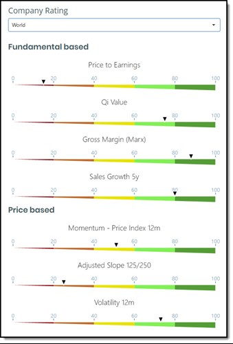
As you can see each indicator has its own gauge where the companies rank, against the group, is shown with a small black triangle.
You can easily see how a company compares to its peers based on four fundamental and three price based indicators.
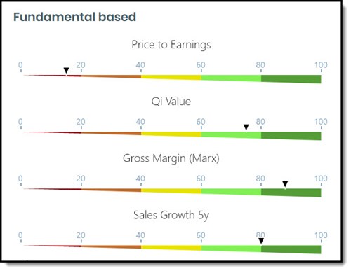
Four fundamental gauges
The four fundamental based indicators are:
- Price to Earnings
- Qi Value Ranking
- Gross Margin (Marx)
- Sales Growth 5 years
This is what they look like:
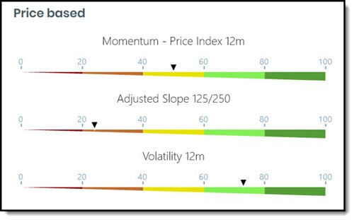
Three price based gauges
The three price based indicators are:
- Price Index 12m
- Adjusted Slope 125/250
- Volatility 12m
The three price based gauges are:
How a company compares
How the company compares to the group is shown with a small black triangle.
All companies are ranked based on its values as a percentage of the companies in the comparison group.
The gauge thus shows you in what percentile the company is, compared to all the comparison companies.
Dark red means bad or expensive
Dark Red – if the company’s value (small black triangle) is in the dark red part of the gauge it means the company is in the 20% of companies that either rank badly or is expensive in terms of that ratio.
Price to Earnings example , if the company ranks dark red in terms of Price to Earnings it meant it is expensive and currently has a Price to Earnings ratio in the highest 20% of the companies it's compared to.
Gross Margin (Marx) example , if the company ranks dark red in terms of Gross Margin (Marx) it meant it currently has a low Gross Margin (Marx) ratio in the lowest 20% of the companies it's compared to. (Reminder: Gross Margin (Marx) = Gross Profits / Total Assets thus the higher the ratio the better)
Price Index 12m , if the company ranks dark red in terms of Price Index 12m it meant it has weak stock price momentum, in other words its 12m price movement is low, or in the lowest 20% of the companies it's compared to.
Dark green means good or undervalued
Dark Green – if the company’s value (small black triangle) is in the dark green part of the gauge it means the company is in the 20% of companies that either rank good or is undervalued in terms of that ratio.
Sales Growth 5y example , if the company ranks dark green in terms of Sales Growth 5y it meant it has high sales growth, in the highest 20% of the companies it's compared to.
Adjusted Slope 125/250 example , if the company ranks dark green in terms of Adjusted Slope125/250 it meant it has good or positive momentum, in the highest 20% of the companies it's compared to.
Volatility 12m example, if the company ranks dark green in terms of Volatility 12m it meant it has low volatility, in the lowest 20% of the companies it's compared to.
Not a subscriber yet? Click here to start using these gauges to improve your company research NOW!
Valuation ratios
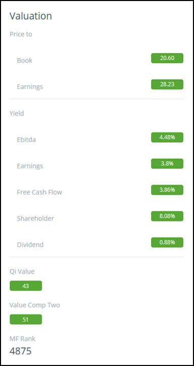
The Valuation part of the dashboard gives you an overview on exactly how the company is valued.
Remember Ebitda, Earnings and Free Cash Flow Yield are all calculated using Enterprise Value.
Qi Value and Value Composite Two uses ranking system from 1 to 100. With 1 = the best ranking and 100 the worse.
MF Rank is the company's Magic Formula ranking and has values from one (best ranked) up to how many companies are included in the screener database.
Historical valuation numbers
The dashboard also shows you historical valuation numbers.
It is very easy to use simply hold your mouse over the historical icon and the chart will appear – this is what it looks like:
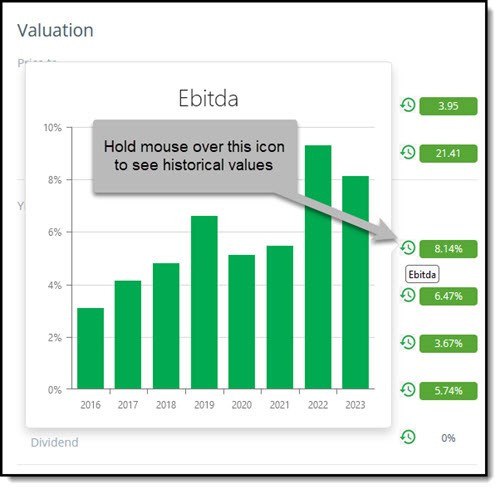
How the valuation of Apple has developed
This is how the valuation of Apple has changed over the past eight years.
The chart below shows you the current valuation, as well as on this day over the past seven years.
Price to Earnings
This is how Apple was valued over the past eight years on a Price to Earnings (PE) basis.
Even though its PE ratio has dropped from over 35 to just over 25 it is still a lot more expensive than in 2019.
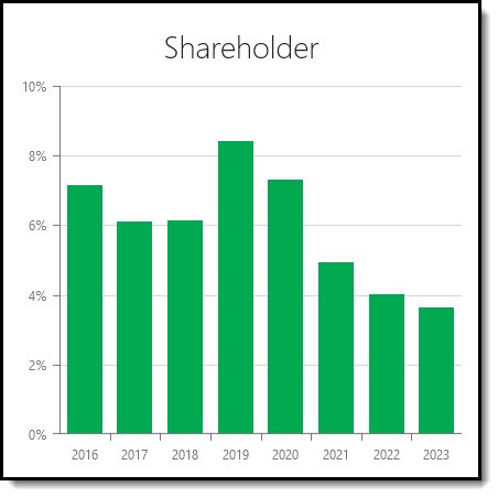
Shareholder Yield
A quick reminder. Shareholder Yield is the sum of Apple’s Dividend yield + Percentage of Shares Repurchased.
As you can see its shareholder yield has not been this low over the past eight years, mainly due to lower stock buybacks. .
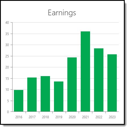
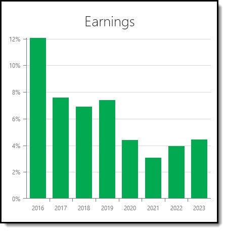
Earnings Yield
Earnings Yield (EBIT to EV) equals Apple’s operating Income or earnings before interest and taxes (EBIT) divided by Enterprise Value.
As you can see also in terms of Earnings Yield Apple is not cheap compared to its past valuation.
Click here to start using historical valuations to find better investment ideas NOW!
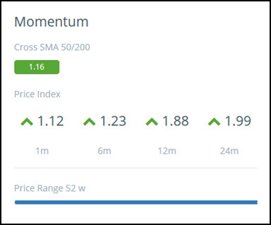
Momentum ratios
The dashboard shows you six momentum ratios.
Cross SMA 50/200 or Golden Cross is calculated as the 50 day simple moving average divided by the 200 day simple moving average. If the Cross SMA 50/200 value is > 1 the 50 day moving average is above the 200 day moving average, this is a positive share price momentum indicator.
Price Index 1m, 6m, 12m and 24m shows you the current share price / share price 1, 6, 12, 24 month/s ago. It's a ratio that shows the return of a share price over a past period. For example if the 1m Price Index is 1.12 it means the stock price is up 12% over the past month.
Price Range 52 w is calculated as the current price / maximum price over past 52 weeks. It is a ratio you can use to see where the stock currently is compared to its 52 week high. In the above image the price it currently at its 52 week high.
Company compared to others in the screen or Watchlist
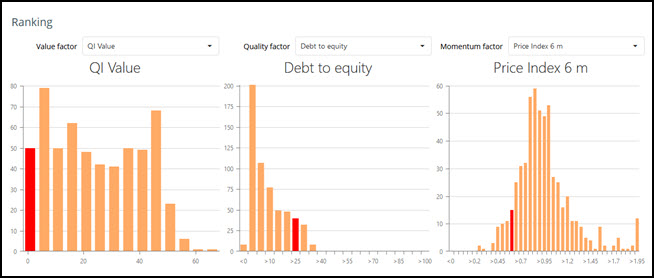
The Ranking section shows you where the company is ranked compared to other companies found with the screen or a Watchlist you have loaded.
Remember: a comparison will only be show if the company appeared in a screen or if it is part of a Watchlist you loaded. If you searched for only this company no comparison will be shown.
The company’s ratio values are shown in bright red.
You can change the ratios and indicators by clicking on the drop down lists above each chart.
Stock price chart
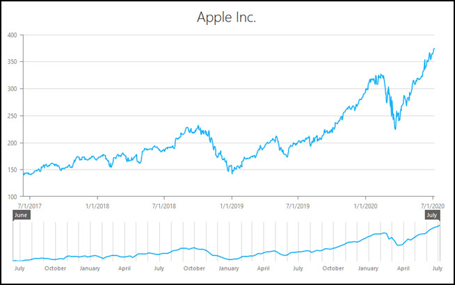
The price chart shows you the closing stock price of the company.
Drag the gray ends of the bottom chart to change the time period shown on the top chart.
To go back to the list of all the companies in the screen or Filter click the Back to list buttons at the top and bottom left of the page.
Frequently Asked Questions (FAQs) For Researching Companies Using the Quant Investing Stock Screener
1. How do I find more information about a company using the stock screener?
Click on the company name in the screener results. This opens the company information page with details like:
- what the company does,
- its valuation,
- growth, and
- stock price.
It’s a quick way to get a full picture of the company.
2. What kind of information can I see on the company’s page?
The company page shows ratios and indicators for valuation, quality, momentum, and growth. You also get a description of the business, trading value, and the latest financial results.
This helps you understand the company better.
3. How can I compare a company to others in its industry?
The dashboard lets you compare the company to:
- others companies worldwide,
- in the same country, or
- in the same industry.
It shows how the company ranks on fundamentals like Price to Earnings, Sales Growth, and more. You can see if it’s better or worse than its peers.
4. What do the colour codes on the dashboard mean?
Dark red means the company ranks poorly or is expensive.
Dark green means the company ranks well or is undervalued.
This colour coding helps you quickly see if the company is good or bad in terms of different ratios.
5. How do I check a company’s historical valuation?
Hover your mouse over the historical icon on the dashboard. This shows how the company’s valuation, like Price to Earnings or Shareholder Yield, has changed over time.
It helps you see if the company is cheaper or more expensive now compared to the past.
6. What is the Piotroski F-Score and why is it important?
The Piotroski F-Score is a measure of a company’s financial health.
It’s made up of 9 factors. A higher score means the company is financially stronger. This score helps you find better quality companies to buy.
PS If you are not a screener subscriber yet you can sign up right here.